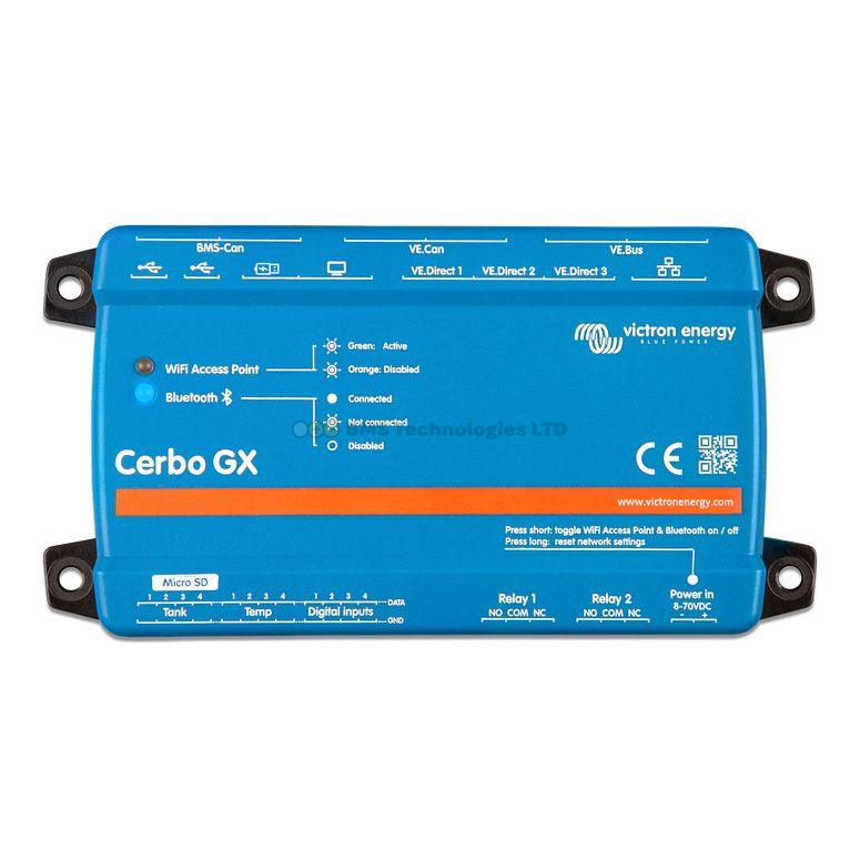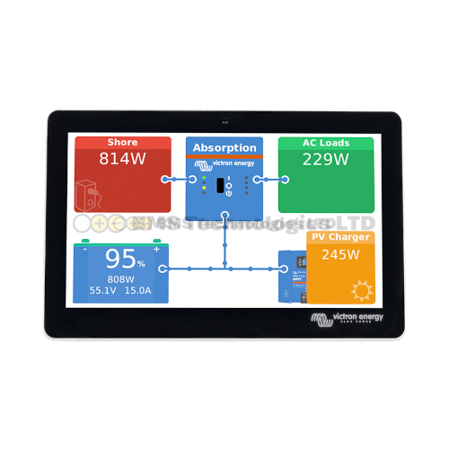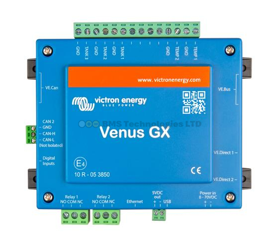
The Victron Remote Monitoring portal (VRM) at vrm.victronenergy.com is where you can see everything your Victron system is doing — in real time and historically. If you have a GX device (Cerbo GX, Ekrano GX, or similar) connected to the internet, VRM gives you a comprehensive dashboard accessible from any web browser or the VRM mobile app. This guide walks you through each section of the VRM dashboard and explains how to interpret what you see.
Getting to Your VRM Dashboard
Log into vrm.victronenergy.com with your Victron account. If you have not yet set up an account or linked your GX device, you need to do this first — the GX device's VRM portal ID (displayed on the GX screen under Settings > VRM Online Portal) is used to register the installation.
Once logged in, you will see a list of your installations (most people have one). Click on the installation name to open its dashboard.
The Overview Page
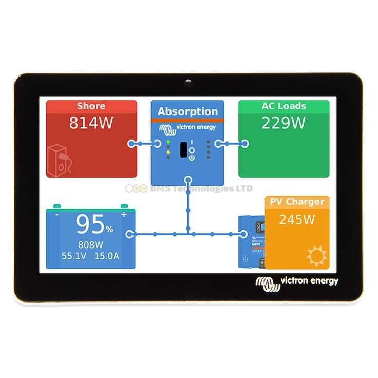
The overview page is the main dashboard you see when opening an installation. It shows a live flow diagram of your entire system — a visual representation of energy flowing between solar panels, batteries, AC loads, grid, and generator.
The Flow Diagram
The flow diagram is the centrepiece of VRM. It shows:
- Solar production (top or left) — current watts from your MPPT charge controllers, shown with an animated yellow line flowing toward the battery or loads
- Battery (centre) — current state of charge (SOC percentage), voltage, and whether the battery is charging (arrow in) or discharging (arrow out), along with the power in watts
- AC loads (right) — total watts being consumed by your AC loads, fed from the inverter
- DC loads — if measured, shows DC power consumption separately
- Grid or shore power (left) — for grid-connected or shore power systems, shows power flowing in from the grid or out to the grid (for ESS systems that export)
- Generator — if a generator is connected and running, it appears with its current output
The animated lines show direction and relative magnitude of power flow. Thicker, faster-moving lines indicate higher power. This is a real-time view — the data updates every few seconds when the GX device has a good internet connection.
The Battery Widget
The battery section of the overview shows:
- State of charge (SOC) — displayed as a percentage. This is the most important number for most users. 100% means full; 0% means empty (though you should never actually reach 0%)
- Battery voltage — the current terminal voltage. For a 12V system, expect roughly 12.0V (empty) to 14.4V (charging). For 24V, double these figures; for 48V, quadruple them
- Battery current — positive means charging; negative means discharging. Shown in amps
- Battery power — current times voltage, shown in watts. Positive = charging, negative = discharging
- Time remaining — an estimate of how long until the battery is empty (when discharging) or full (when charging), based on current rates. This can be wildly variable if loads fluctuate
Interpreting Battery SOC
For lead-acid batteries, keep the SOC above 50% for long battery life. Regularly discharging below 50% significantly shortens their lifespan. For lithium (LiFePO4), you can safely use 80-90% of capacity, so an SOC of 10-20% is the practical floor for daily use.
The Solar Widget
This section shows data from all connected MPPT charge controllers:
- Current solar power — total watts being produced right now across all MPPT controllers
- Solar yield today — total energy harvested since midnight, in kilowatt-hours (kWh)
- Peak power today — the highest instantaneous wattage recorded today. Useful for checking if your panels are performing as expected
- MPPT state — shows whether the controller is in Bulk (flat-out charging), Absorption (holding voltage, reducing current), Float (maintenance), or Off
If you have multiple MPPT controllers, VRM shows individual data for each one in the device list, plus a combined total on the overview. This lets you identify if one string of panels is underperforming relative to another — useful for spotting shading problems or a failed panel.
The AC Consumption Widget
Shows the total power being consumed by your AC loads:
- Current consumption — total watts right now
- L1, L2, L3 — for three-phase systems, shows consumption on each phase separately
- Cumulative consumption today — in kWh, how much AC energy you have consumed since midnight
For off-grid systems, comparing AC consumption to solar yield tells you whether you are living within your means. If daily consumption consistently exceeds daily solar yield, your battery SOC will trend downward over time.
The Advanced Tab
The advanced tab provides detailed graphs that go beyond the overview widgets:
Available Graphs
- Battery SOC over time — the most useful graph for understanding your system's daily pattern. You should see SOC dropping overnight as loads run, then recovering during the day as solar charges the battery
- Battery voltage over time — useful for diagnosing charging problems. You should see voltage rise during bulk and absorption, then settle at float
- Solar yield per day — a bar chart showing daily solar harvest. Useful for seasonal comparison and spotting issues (a sudden drop might indicate panel soiling or shading)
- AC consumption per day — track your energy usage patterns
- Temperature — if temperature sensors are connected, shows battery temperature over time
- System overview — combines multiple data streams into one graph for correlation (e.g., comparing solar input vs battery SOC vs AC consumption)
Adjusting the Time Range
Use the time range selector to view data from the last hour, day, week, month, or custom range. Shorter ranges show higher-resolution data. Longer ranges aggregate data into averages — useful for spotting trends but you lose the minute-by-minute detail.
Historical Data
VRM stores your system data indefinitely (as of 2025, Victron provides free unlimited data storage for VRM users). This means you can:
- Compare months — how did January's solar yield compare to June's? Essential for sizing a system for winter in the UK, where solar production can be 10-15% of summer levels
- Compare years — is your system degrading over time? Are your panels producing less than last year at the same time?
- Identify patterns — do you consistently run low on battery on certain days? The historical data will show this
Exporting Data
VRM allows you to export data as CSV files for analysis in a spreadsheet. Go to the Advanced tab, select your date range and data points, then use the download button. This is useful for detailed analysis — for example, calculating your average daily consumption per month, or correlating battery temperature with charge efficiency.
The Device List
Found under the Device List menu item, this shows every Victron product connected to your GX device:
- Product name and model
- Firmware version (with update notifications if outdated)
- Connection type (VE.Direct, VE.Bus, VE.Can)
- Current operating state
Click on any device for detailed information and real-time data specific to that product. This is where you go to check firmware versions and initiate remote updates.
Alarm Logs
VRM records every alarm and warning generated by your system. Access these under Alarm Logs in the menu. Common alarms include:
- Low battery voltage — the battery dropped below the configured threshold
- High battery voltage — possible overcharging or failed voltage regulation
- High temperature — a device or battery exceeded its safe operating temperature
- Grid lost / Grid found — for grid-connected systems, showing when mains power was interrupted
- Inverter overload — the MultiPlus/Quattro was asked to deliver more power than it can handle
You can configure VRM to send email or push notifications when specific alarms occur. This is particularly valuable for remote systems — if you have an off-grid cabin or a boat on a mooring, you want to know immediately if something goes wrong.
VRM Mobile App vs Web Interface
| Feature | Web Interface | Mobile App |
|---|---|---|
| Flow diagram | Yes | Yes |
| Advanced graphs | Full | Limited |
| Data export (CSV) | Yes | No |
| Remote Console | Yes | Yes |
| Alarm notifications | Push notifications | |
| Remote firmware updates | Yes | No |
| Offline access | No | Limited caching |
The mobile app is excellent for quick status checks — glancing at your battery SOC and solar production while away from home. The web interface is better for detailed analysis, configuration changes, and data export.
Tips for Getting the Most from VRM
- Set up alarm notifications — email alerts for low battery, high temperature, and inverter overload are essential for remote systems
- Check weekly — even if everything seems fine, a weekly glance at the graphs catches slow-developing problems (e.g., gradually declining solar yield due to dirty panels)
- Use the SOC graph for system sizing — if your battery SOC regularly drops below 30% in winter, you probably need more battery capacity or more solar panels
- Compare solar yield to panel ratings — if your 400W panel system is peaking at 200W on clear summer days, something is wrong (shading, orientation, or a faulty panel)
- Export data before making changes — if you are about to reconfigure your system, export the current data first so you can compare before and after performance
To understand the difference between VRM and Remote Console (a deeper level of control), see our Remote Console guide. For help updating firmware through VRM, read our firmware updates guide. And for understanding the products that feed data into VRM, check our communication protocols guide.